

O! Say can you see …
|
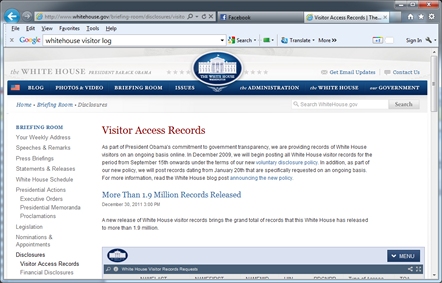
As part of President Obama's commitment to government transparency, the White House has elected to release the logs kept about their daily visitors. Currently, 1.95 million records are available. (If you are interested, you can find out more details on the program by clicking on the image to the right). The information in the log contains: First Name, Last Name, Middle initial, various dates, the type of visit and a couple of esoteric fields about the visit. According to the website, this data is obtained about all visitors, over the age of 18, who visit 1600 Pennsylvania Avenue. 
|
 |
The White House is a busy place! As of the time I pulled my database, the highest number of recorded visitors in one day was 9,044 back on June 29, 2010. In the last 24 months of records there were 58 times when there were more than 5,000 visitors in a day.
Demographics
There is no gender column in the data, and no indication of age. I was curious about the demographic breakdown of the people who visit.
If you’re a regular reader of my blog, you’ll know that I’ve built a database of probability distributions for gender and age based on names. You can read about the background of this in these three blog postings Part 1, Part 2 and Part 3, but in summary, names change in popularity over time, so given a name, such as Barbara it’s possible to estimate the probability of the gender and age of a person with that name.
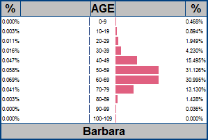
Barbara for instance, is a very female name, and whilst very popular in the 1920’s and 1930’s, quite a large number of people born with that name during that time have sadly passed away, thus rarefying the curve from that end. The charts below show the product of counting all the people who were born with that name (from social security records), attenuated by the percentage chance that someone of that age will still be alive (based on CDC records of deaths based on life expectancy for people born in that year).
|
If you meet someone called Barabara, for instance, there is a 62.121% they are a female between the age of 50 and 69 (obtained by adding the 31.126% and 30.995% for the age bracket 50-59 and 60-69). |
|
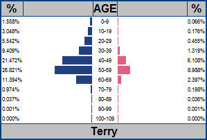
Terry appears to be a more transgender name. Not so much anymore, but in the 1950’s it was a fairly common name for both males and females. |
|
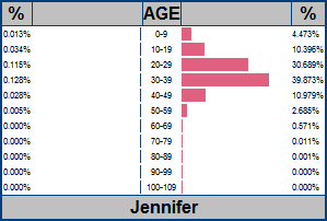
For comparison Jennifer is a much younger girl’s name, with peak popularity corresponding to people currently in the age bracket 30-39. (In the last decade of the 20th century, the most popular girls name was Emily, and for the boys it was Jabob). |
In my database I’ve compiled probability curves for approximately 87 thousand names, and joining this with the White House dataset yields an average of 95% coverage (The missing percentages are very obscure names, typically canonical spellings of names that I don’t have).
Scrubbing
The data from the White House source was reasonably clean, and imported into SQL server with just a light touch-up pass. It's incredibly rare that I get a data source that imports without any errors. In the dump of the databases I obtained, there were 1,950,154 rows. The earliest records were marked 1/20/2009, but it appears at this time that full reporting was not yet happening (just a couple of dozen visits a day were recorded); promiscuous recording seems to start around 9/17/2009.
Results
Below is a plot of the percentage of visitors broken down by estimated gender. Estimated female visitors are shown in pink. Estimated male visitors are shown in blue, and unmatched names are shown in green.
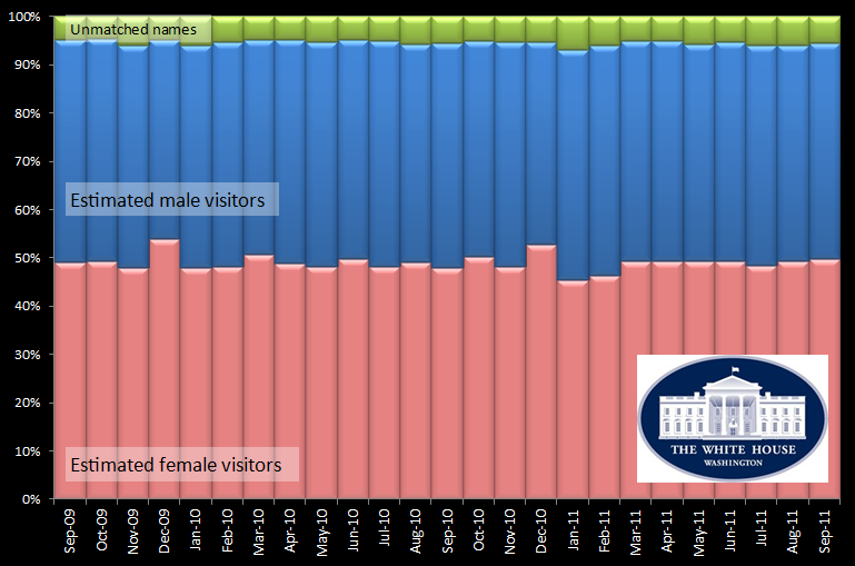
For eleven months of the year, the percentage of male visitors is slightly higher than the percentage of female visitors. The exception is the month of December. Each December, it swings the other way. Why is this?
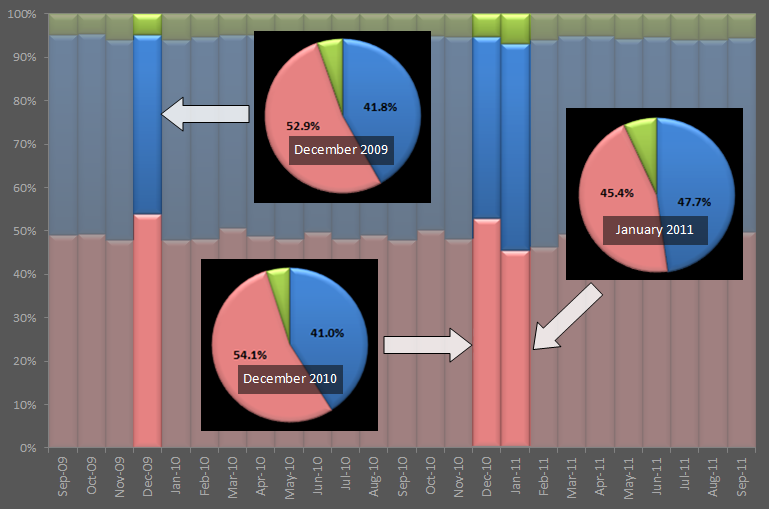
For instance, in January 2011, the Male:Female ratio is 1.050, (ignoring the unknowns) but a month earlier, in December 2010, the Male:Female was 0.791. The graphic below shows the pie-charts of this distribution.
Speculation
 Official White House Photo by Chuck Kennedy |
Why this change in December? I'm going to speculate that a higher percentage of women chose to visit the White House over the holiday season to visit the spectacular decortations that are put on display. If anyone can think of a different plausible hypothesis, do drop me an email.
|
Closer look at age breakdown
With the understanding that there should be no names on the visitor database for people under the age of 18, here is a breakdown of the genders for the decades of age. (I'm comparing the two months December 2010, and January 2011).
|
|
||||||||||||||||||||||||||||||||||||||||||||||||||||||||||||||||||||||||||||||||||||||||||||||||||||||||||||||||||||||||||||||||||
It's hard to make out the changes from this coarse table, so below are the relative changes for each age for the difference in percentages for each gender independently. As you can see, the male delta is flatter, with smaller deviances in the age breakdown between the holiday month and the non-holiday month. (On the graph, points above the line represent an increase in the percentage people of that age for the month of December cf. January.
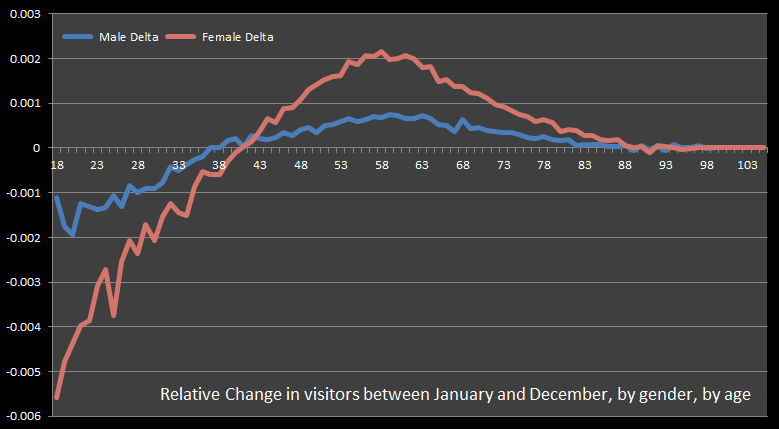
For females, the change is more pronounced with a much larger change in the demographic breakdown. There is a negative change in the number of younger women visitors and a bigger change in the middle-aged to older visitors. The biggest percentage change being for women aged 58. REMEMBER, however, that these graphs represent relative changes at each age, not absolute. I'm not saying that more women aged 58 visit the White House in December, I'm saying that this age shows the biggest change from a non-December month i.e. the first derivative.
Happy Birthday
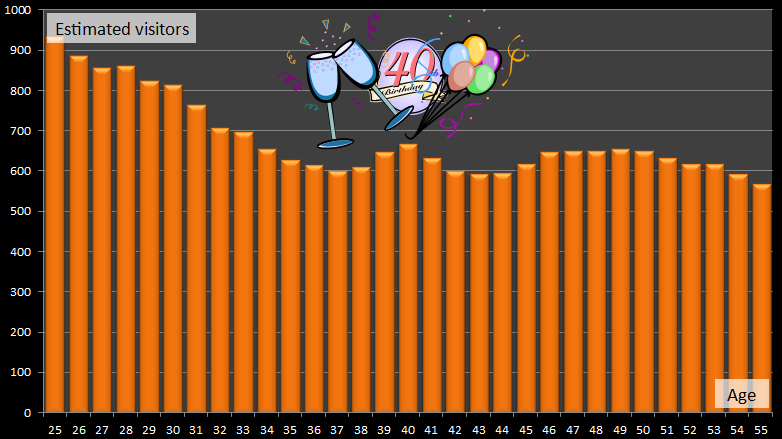
The other interesting fact that bubbled through the data is that when the thousands of individual probability curves for each visitor name were superimposed, an interesting peak arose. This peak corresponded to people who are 40 years old! It seems that visiting the White House to celebrate one's 40th birthday party is the thing to do!
You can find a complete list of all the articles here. Click here to receive email alerts on new articles.

© 2009-2013 DataGenetics